Effective website communication requires striking a careful balance between user experience and business objectives. While poorly timed modals can disrupt navigation, strategically designed pop-ups remain a vital tool for capturing leads, promoting offers, and engaging visitors. Gathering email addresses and sharing important news doesn't have to be complicated. By setting up a pop-up in Positive User, your team can easily show the right message to the right people while they browse your website.
In Positive User you can find two possible options to create a pop: Pop-up Builder vs Pop-up Code Editor.
This option allows you to create basic pop-ups on the basis of the predefined templates. You can personalize the content and upload own images.
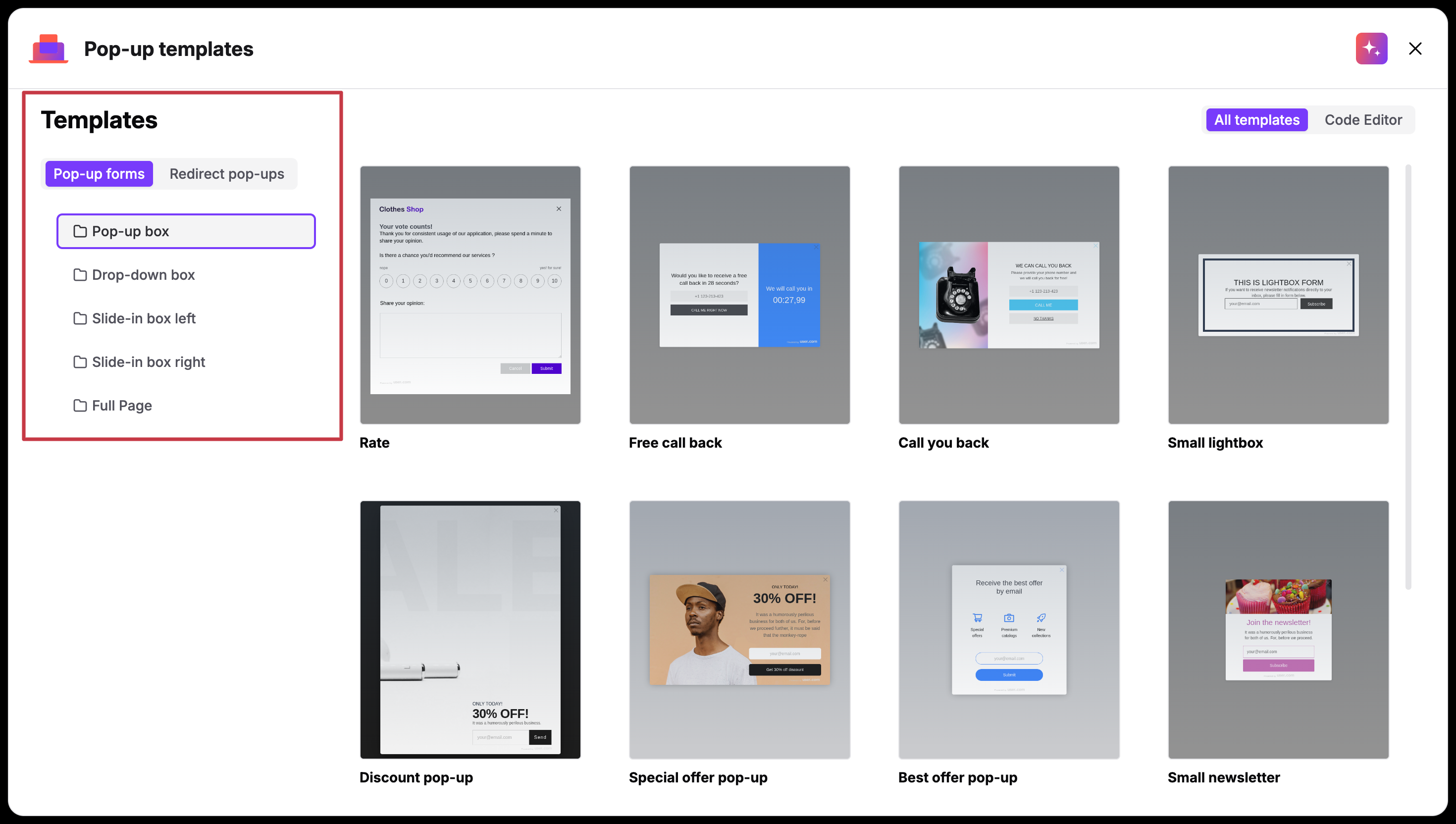
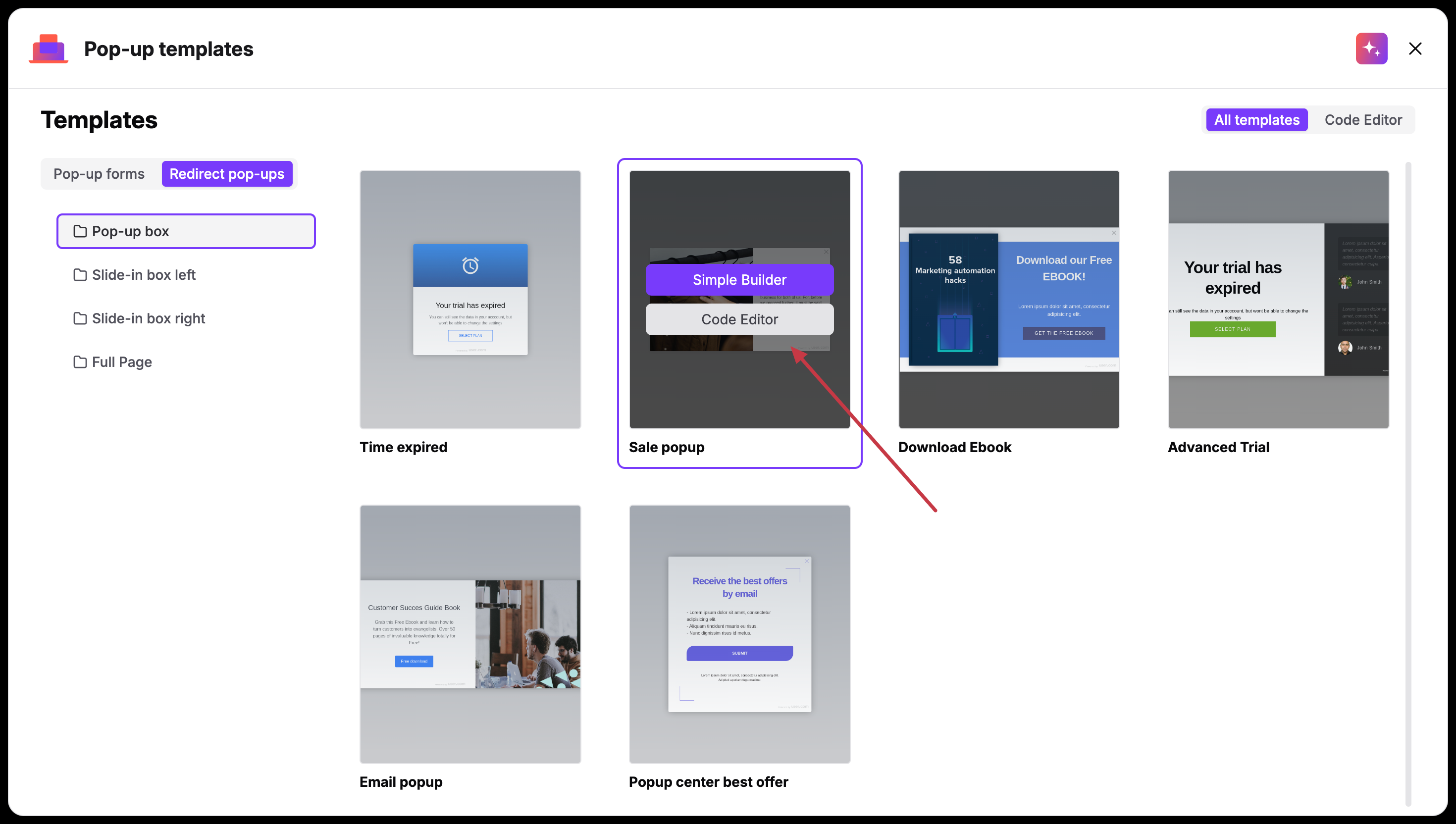
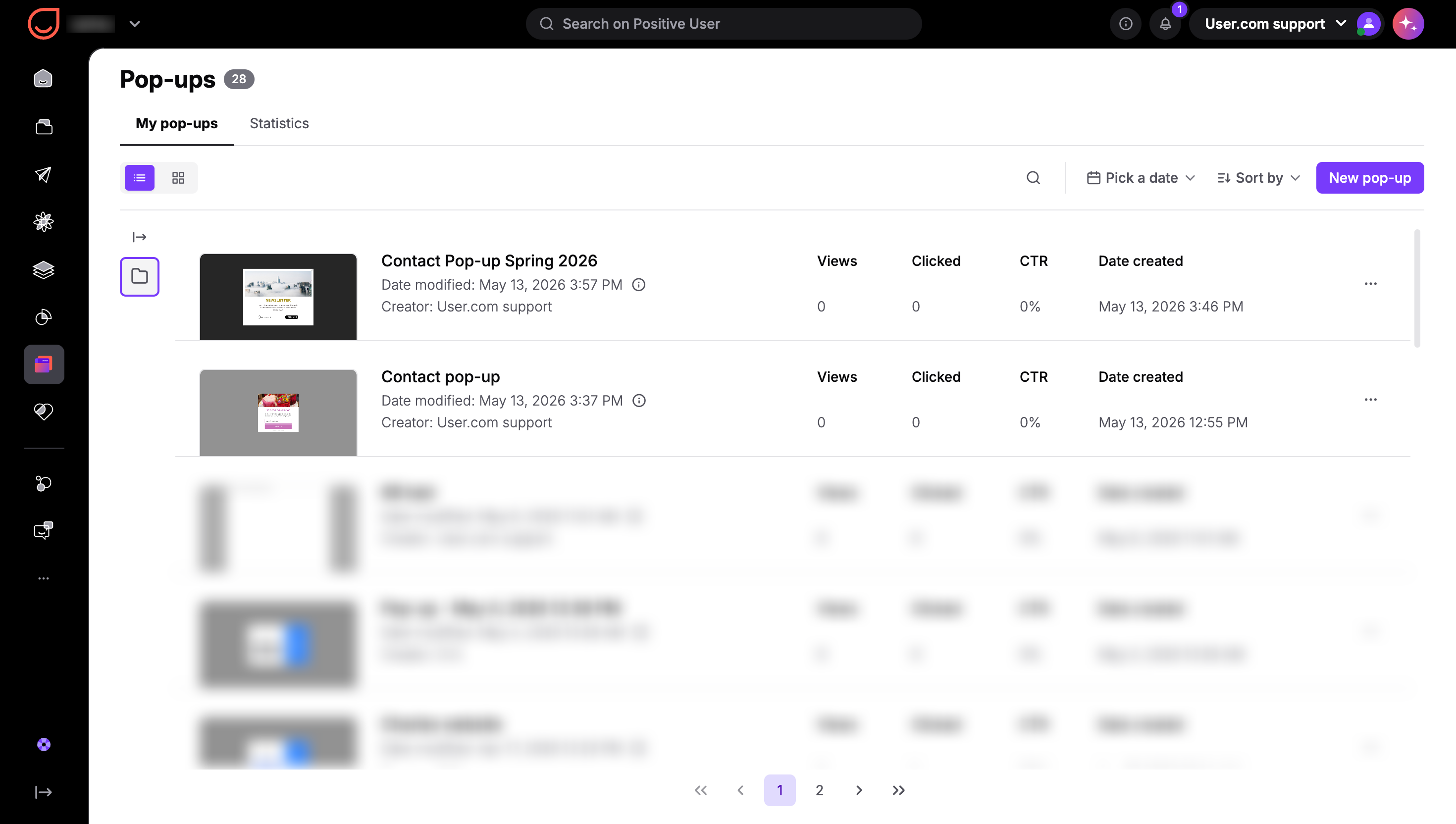
Go to “Website Experience” → “Pop-ups” → “New pop-up”.
Choose between “Pop-up forms” and “Redirect pop-ups” in top left corner of the section.
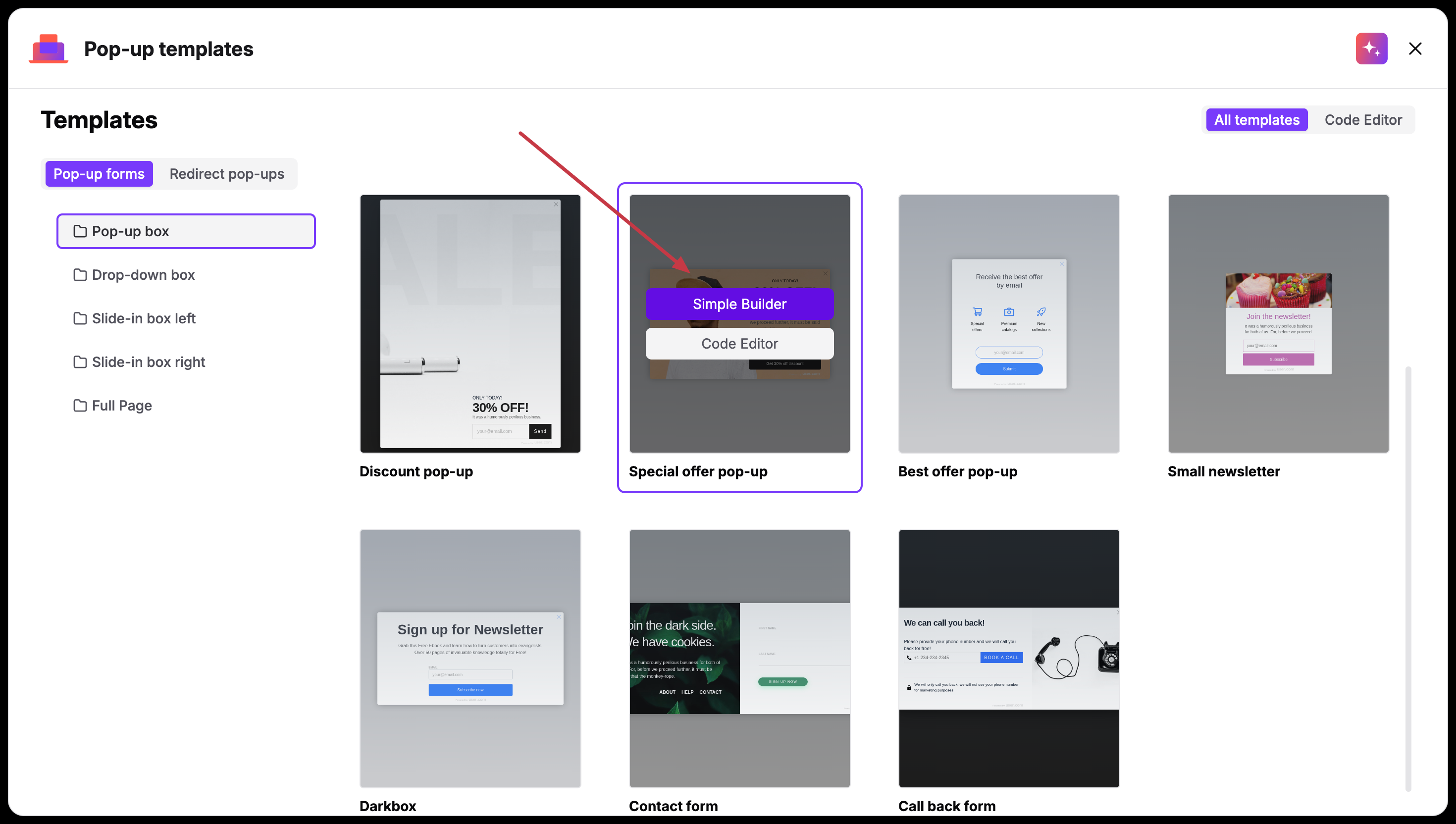
Pick one of the templates, hover over it and choose “Simple Builder”.
Type the name of the pop-up and add a description for your teammates.
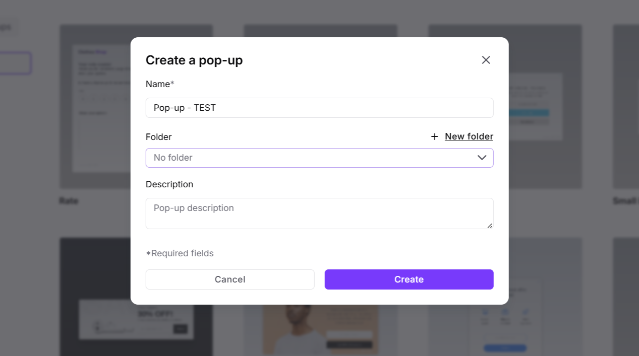
Click “Create”. Now you are in the panel where you can change the pop-up's content.
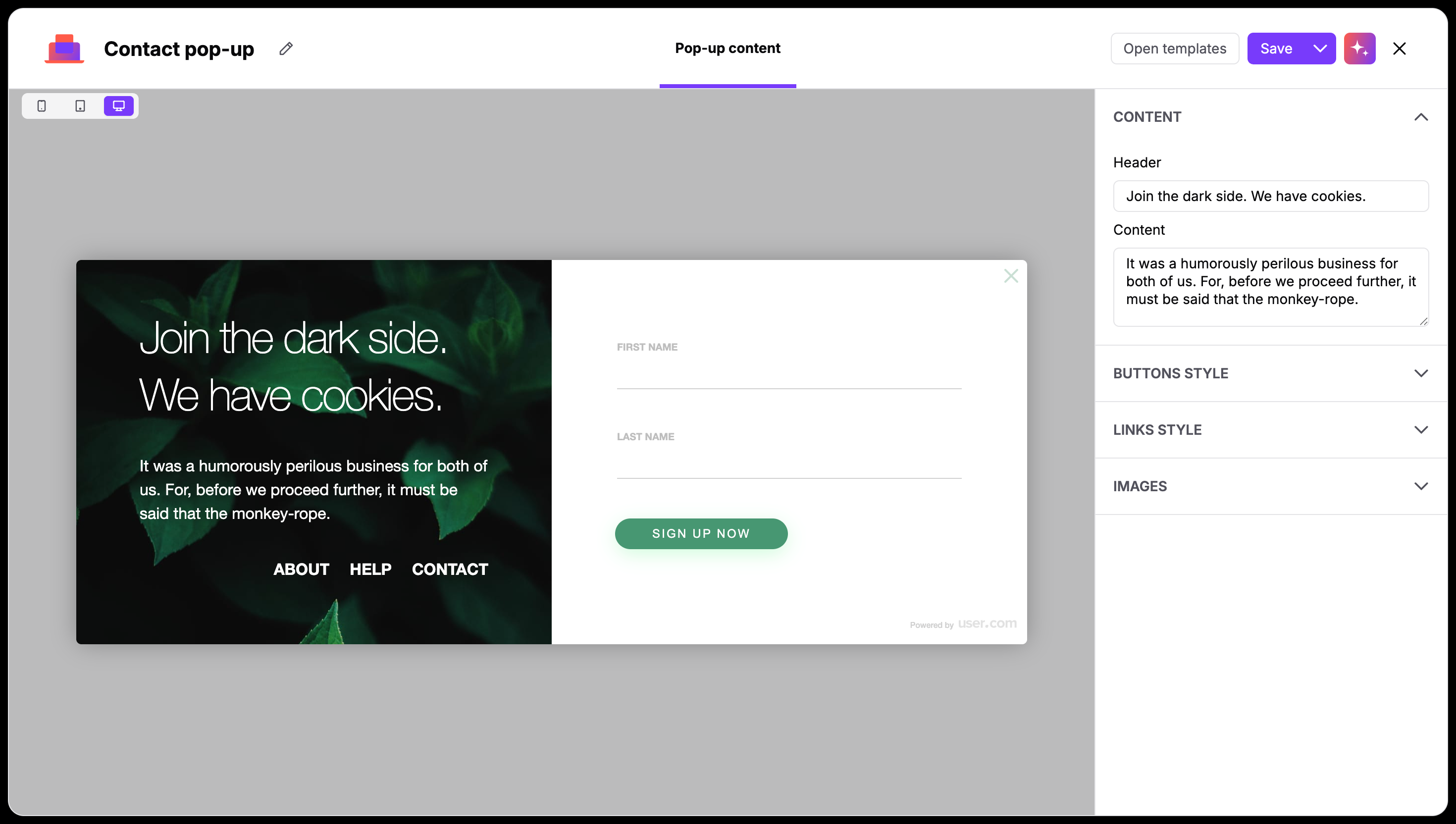
The main section shows the preview of the chosen template, where all the changes are reflected in real time. You can always change the template by clicking on “Open templates” button in top right corner of the editor.
In top left corner you can switch between mobile and desktop modes - this allows you to perfectly adjust pop-up’s appearance.
On the right side you have sections for changing individual parts regarding the content and display of the pop-up.
Content
In this section, you establish the primary communication of your pop-up.
Header: This is your primary headline. Use this space for your most important offer or announcement (e.g., "Join our newsletter" or "Check out the new collection").
Content: This field is for your supporting text. It’s a great place to add a bit more detail or provide the "why" behind your call to action.
Buttons style
The button is the main interaction point of your pop-up. You want it to be clear and visually distinct.
Button: Type in the text that will appear on the button itself. Short, action-oriented labels like "Sign up now" or "Get the discount" usually work best.
Text color: Choose a color for the label inside the button. Make sure there is enough contrast against the background so it’s easy to read.
Background color: Select the primary color for your button. It’s recommended to choose a brand-specific color to maintain a consistent look across their site.
Links style
Depending on a template you can give your visitors more options like a link to a "Help" page or "Contact" info as secondary links here.
Text: Enter the name of the link (e.g., "About Us" or "Privacy Policy").
Open in: Decide if the link should open in a new or current tab.
Text color: You can style these links separately. Often, a subtle color works well here so they don’t distract from the main button.
Images
The visual elements tie the whole pop-up together and ensure it feels like a native part of your website.
Background image: The main image of your pop-up.
Backdrop color: This controls the "overlay" that dims your website when the pop-up appears. You can adjust the RGBA values to make the background more or less transparent, keeping the focus entirely on your message.
Background color: This sets the base color for the pop-up where your text and form fields are located.

Inputs
If you are creating a pop-up form, then this section allows you to define the information you want to collect from your visitors. Each field you add here will map directly to the data in the contact profile.
Label: The text that appears directly above the input field, telling the person what to enter.
Placeholder: The "ghost" text inside the field (e.g., "[email protected]") that disappears once the user starts typing.
Attribute: This is a crucial step. It tells the system which field in your Positive User database the information should be saved to (e.g., "Email" or "First Name").
Required?: Check this box if the field must be filled out before the user can submit the form.
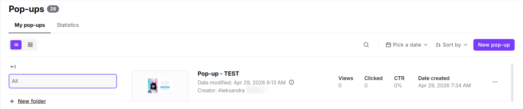
When your pop-up is ready, click "Save and exit". You will then be redirected to your pop-up list.
Remember, that now to activate a pop-up, you need to create an automation for it.
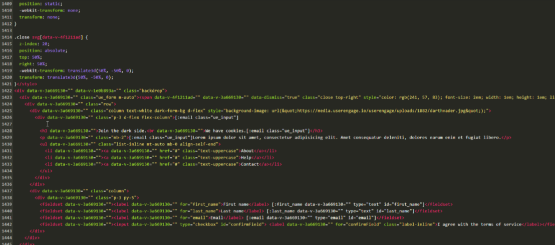
You can definitely build custom pop-ups directly in the HTML code. Our code editor is the right place for it. It can be either creating the pop-up from scratch or modification of the existing templates.
This option requires the HTML knowledge.
Go to “Website Experience” → “Pop-ups” → “New pop-up”.
Here you can choose either to start from scratch clicking on “Code Editor” button on top right corner of the section or edit one of the existing templates. To do so, you need to decide on the type (“Pop-up forms” vs “Redirect pop-ups”) in top left corner of the section, pick one of the templates, hover over it and choose “Code Builder”.
Now you are in the panel where you can adjust the pop-up. (Or create from scratch if chose the “Code editor” straight away in the previous step).
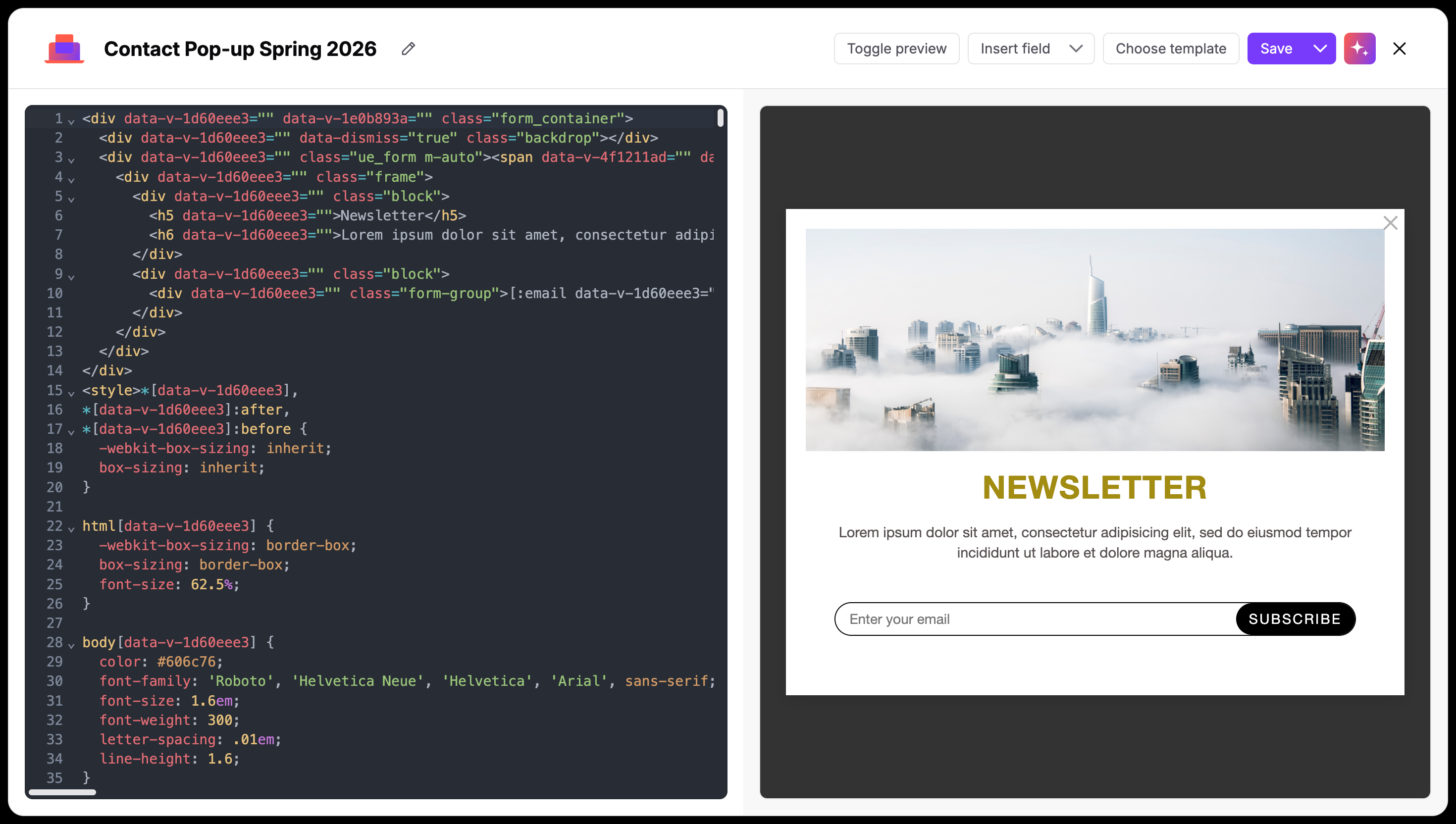
Full HTML & CSS Control
The left-hand pane is a fully functional editor where you can define the structure and look of your pop-up. You can customize the structure of your form, add custom wrappers, or include extra elements like icons or specialized text blocks that aren't available in standard templates.
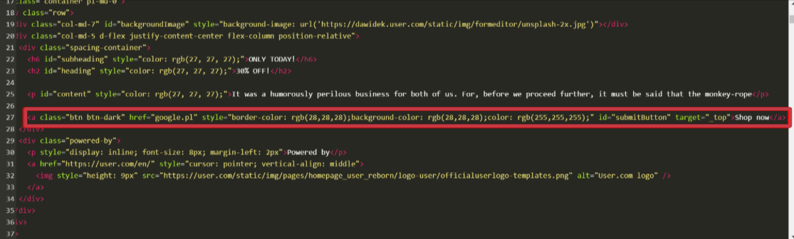
Insert Field
One of the most powerful features of the code editor is the Insert field dropdown. This allows you to bridge the gap between your custom design and your Positive User database.
Dynamic Placeholders: Instead of manually coding form inputs, use this menu to insert placeholders for specific attributes (e.g., “Email”, “First Name”, or “Phone Number”).
Custom Attributes: If you have created custom attributes (like "Loyalty Tier" or "Favorite Category"), you can find them here and include them in your form. When a contact fills these out, the data is automatically saved to their profile.
Toggle Preview
Use this button to switch between your code and a live look at the pop-up. This helps you catch styling errors or alignment issues on the fly.
When your pop-up is ready, click "Save and exit". You will then be redirected to your pop-up list.
Now you need to create an automation flow to activate your pop-up.
Now you have a pop-up prepared. To show this pop-up on the website you need to create an automation in the “Automations” section.
"Show a pop-up" module refers to all the pop-ups created in “Website Experience” → “Pop-ups”.
Example automation looks like this:
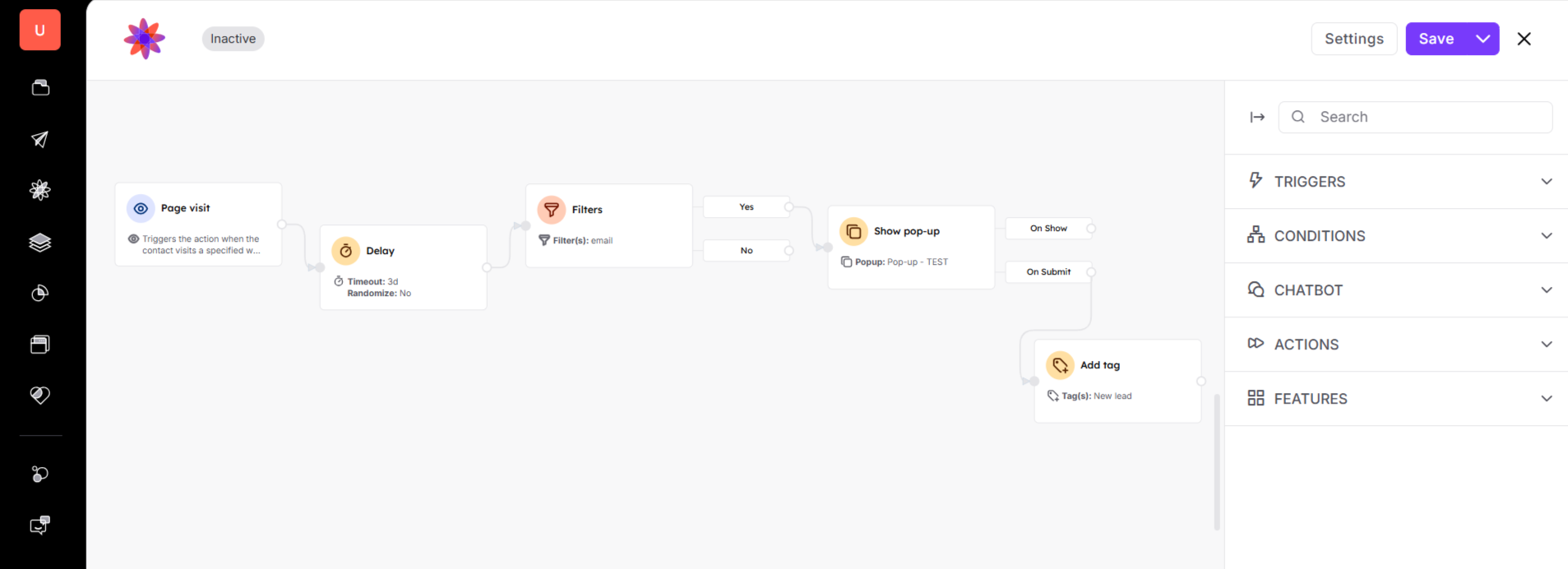
Check articles about automations to build an effective workflow for your website visitors.
Types of Pop-ups [LINK]
