Dashboards give your team a centralized view of all the automated workflows, communication channels, and internal operations you run inside Positive User. Instead of digging through separate windows to check on your email campaigns, support queues, or sales pipelines, you can bring all these live data points onto a single screen. This helps you monitor how your automated processes perform in real time, spot operational bottlenecks early, and track team productivity so you can make fast, data-backed adjustments to your strategy. For an introduction to monitoring metrics, see our “Dashboards Overview” guide.
Set up your custom dashboard and choose the exact metrics you want to display.
Navigate to the "Analytics" section on the left-hand menu to open your dashboards overview.
Click the purple "Create dashboard" button located in the top right corner of the screen.
In the pop-up modal window, type a clear, descriptive name for your dashboard in the "Name" field, then click the purple "Confirm" button.
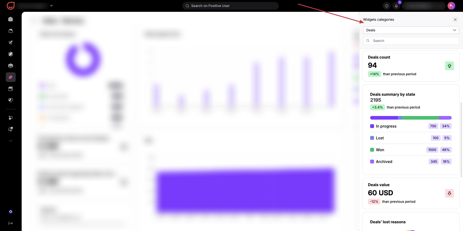
Click the "Add your first widget" box on your new blank dashboard canvas to open the "Widgets categories" sidebar on the right side of the screen. Click the category dropdown menu to choose a specific topic area. You can select from options like "Automations", "Mobile push", "Web push", "Tasks", "Conversations", "Deals", "Segments", "Email", etc. depending on what you want to track. Each individual category contains its own tailored set of available widgets.
Browse through the available widgets for your chosen category. You can choose from main widget types like count, summary by type, result leaderboard, or day-by-day count depending on the metrics you need.
Set up the specific parameters for your widget in the configuration window. Give your widget a custom name, verify the target category, and select a "Date range". You can choose a dynamic range (such as "Current week"), a specific number of days in the past, or a fixed date. If the widget tracks tasks performed by specific team members, you can also filter the data to show only their specific results. Click the purple "Add widget" button to save it to your dashboard.
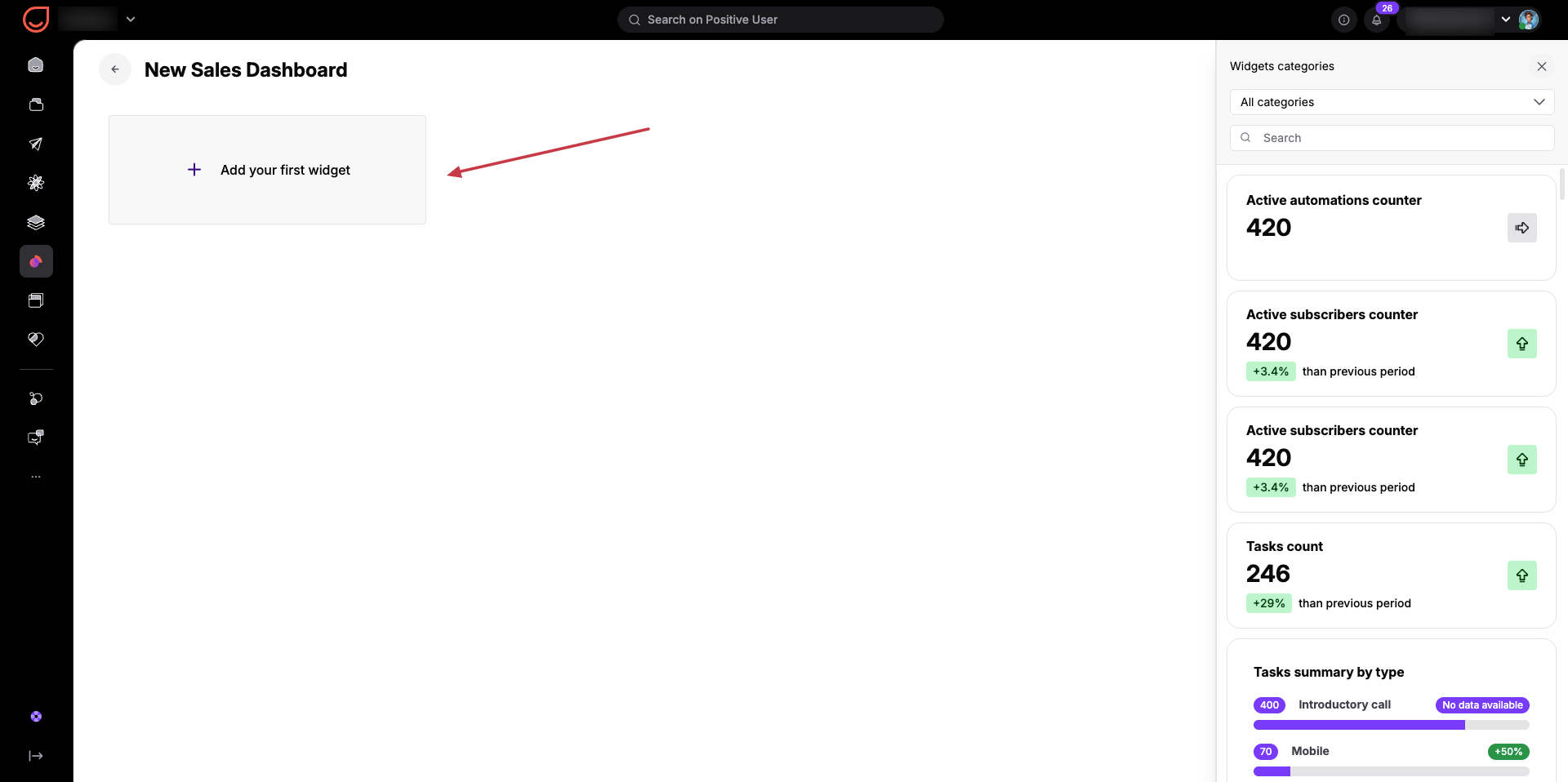
Browse through the available options in your selected category to find the best layout for your data. Your options include:
Counter: A basic stat counter. Some counters only require a name, while others let you pick a date range to compare current numbers with a previous period, showing a percentage increase or decrease.
Summary by Type: A unified summary list. You name the widget and select which specific items or team members to include.
Result Leaderboard: A leaderboard ranking performance. Like summaries, you name the widget, select the included team members, and define the date range.
Comparison Over Time / Day by Day Count: Ideal for tracking contact segments or specific objects over a given timeframe. You choose the object category (like segments), define the specific groups you want to track, and set the date range to generate a daily comparison of group sizes.
Heat Map: Available for conversations and messages. To configure this, define the content type, select the measurement type (such as day-to-team member hours, or hours-to-day), and specify the date range and targeted team members.
Daily Count: Select an object type, target team members, and dates to group by after defining your date range to view a daily status graph.
Specialized Sales Widgets: Designed for deals. You can choose a "Summary by State" widget to track pipeline stages, team members, currencies, grouping dates, and date ranges (showing deal count, percentages in progress, won, lost, or archived). You can also select a "Deal Lost Reasons" widget, which pulls a round pie diagram directly from your workspace configuration.
Email Monitoring: Shows general statistics for your email campaigns, comparing sent, opened, and clicked numbers within your chosen timeframe.
Support and Success: Tracks conversation speed with metrics like "First Response Time Median" or a daily conversation counter. Similar options exist for tracking form visit counters and day-by-day conversion ratios.
Knowledge Base Tracking: Displays a list of your most viewed articles to see what content contacts read the most.
Revenue Goals: Sets a specific financial target for your sales team so you can monitor progress in real time.
Campaign Overview: Provides general statistics for your mobile push notifications and other marketing campaigns.
To design your dashboard layout, organize your metrics, or group widgets together, you need to enter the editing mode.
Click the "Edit dashboard" button in the top-right corner of your screen. Once clicked, the management icons for each widget will appear, giving you full control over your layout:
Edit content: Click the edit icon on any widget to adjust its internal content or configurations.
Move widgets: Click and hold the six-dots icon on a widget to drag and reposition it to any part of the screen.
Delete widgets: Click the delete icon to remove a widget from your dashboard entirely.

When you are satisfied with your layout, click the "Done editing" button in the top-right corner. This returns you to the standard viewing mode, where you can use options like zooming in and out, panning across the canvas, or downloading your data reports.
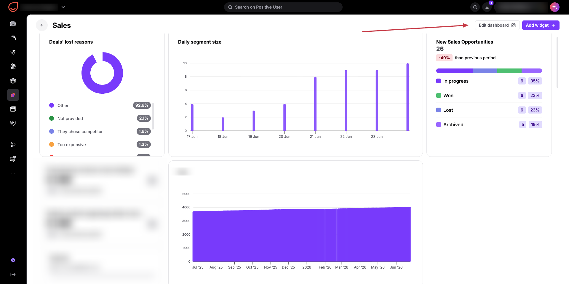
Unified Marketing Engagement Tracking: Your marketing team can combine web push statistics, active contact segment trends, and email performance metrics on a single dashboard to monitor live engagement across different channels without shifting views.
Transparent Sales Performance Tracking: Sales managers can build a custom dashboard featuring a result leaderboard widget filtered by specific team members to evaluate completed tasks, deal counts, and overall sales pipeline status over a dynamic timeframe.
Real-Time Support Volume Monitoring: Support leads can design a dashboard tracking active conversations and support tickets, using day-by-day count widgets to monitor daily contact volumes and audit team member actions.