Web push campaign statistics are metrics that track the delivery, receipt, and click rates of your browser notifications. This data lives inside your Positive User workspace, helping you evaluate whether your real-time marketing campaigns successfully reach your audience. While standard website traffic tells you where contacts go, web push statistics tell you exactly how your direct browser messaging drove them there.
Analyzing your data helps your team understand how your audience interacts with your messages. Positive User tracks web push campaign statistics automatically, giving you the insights needed to refine your marketing efforts and drive better results.
Measuring these statistics from a business perspective lets your team identify what catches your audience's attention and what brings them back to your website. Instead of guessing, you can use real delivery and engagement numbers to make informed choices about your future campaigns.
Your team can review web push performance at a high level using two primary views in the main dashboard.
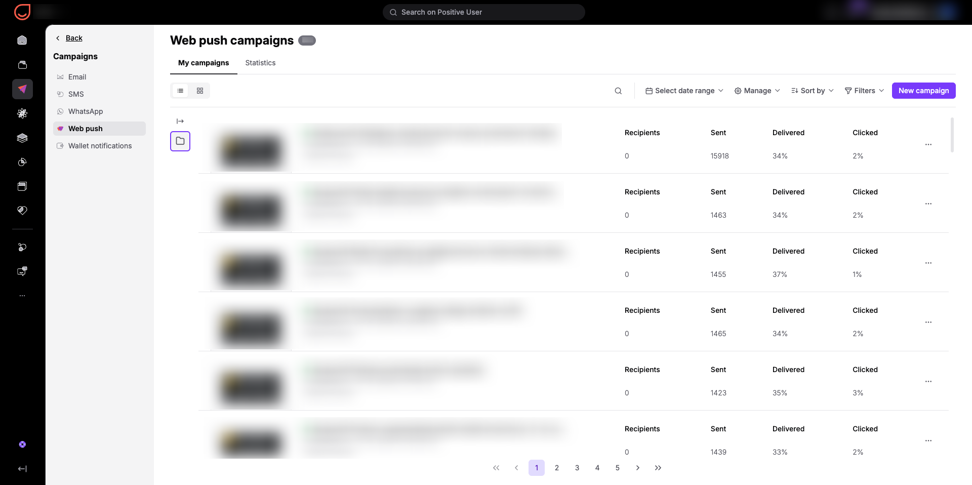
When you enter the “Campaigns” → "Web push" section, you immediately see a list of all your scheduled and delivered campaigns. This view helps you quickly compare campaigns using several main columns:
Recipients: The exact number of contacts targeted. This tells you the size of the audience segment you are attempting to reach.
Sent: The total number of notifications dispatched by the system.
Delivered: The percentage of sent notifications that successfully landed on your contacts' screens. From a business perspective, a low percentage indicates that contacts may have revoked browser permissions or that their devices are inactive.
Clicked: The percentage of delivered notifications that contacts actually opened. This directly measures how compelling your headline and offer are to your audience.
Your team can use the "Select date range" tool to check performance for a specific period of time. You can also click "Sort by" or use "Filters" to organize the list by specific metrics or campaign statuses.
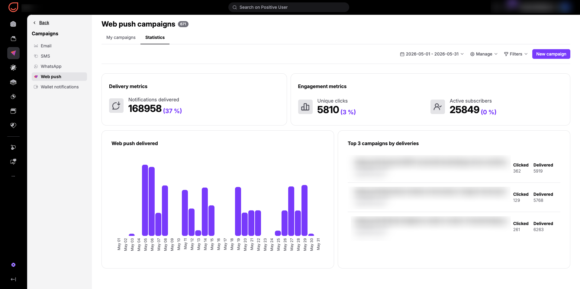
Clicking on the "Statistics" tab switches your view to the general overall stats for all campaigns in your workspace. This panel shows you what your push messaging brings to your company as a whole over a chosen period of time:
Delivery metrics: Displays the total count of "Notifications delivered" alongside your workspace delivery rate percentage. This proves the technical health of your push setup and shows how many contacts are actively reachable.
Engagement metrics: Tracks "Unique clicks" and your total "Active subscribers". Watching the active subscriber count helps your business monitor audience growth and list retention trends over time.
Web push delivered: A bar chart mapping out daily delivery volumes, helping you see which days of the week your contacts are most active online.
Top 3 campaigns by deliveries: Automatically highlights your most successful campaigns based on total deliveries and clicks. This reveals your most effective copy and offers, allowing your team to copy that success in future campaigns.
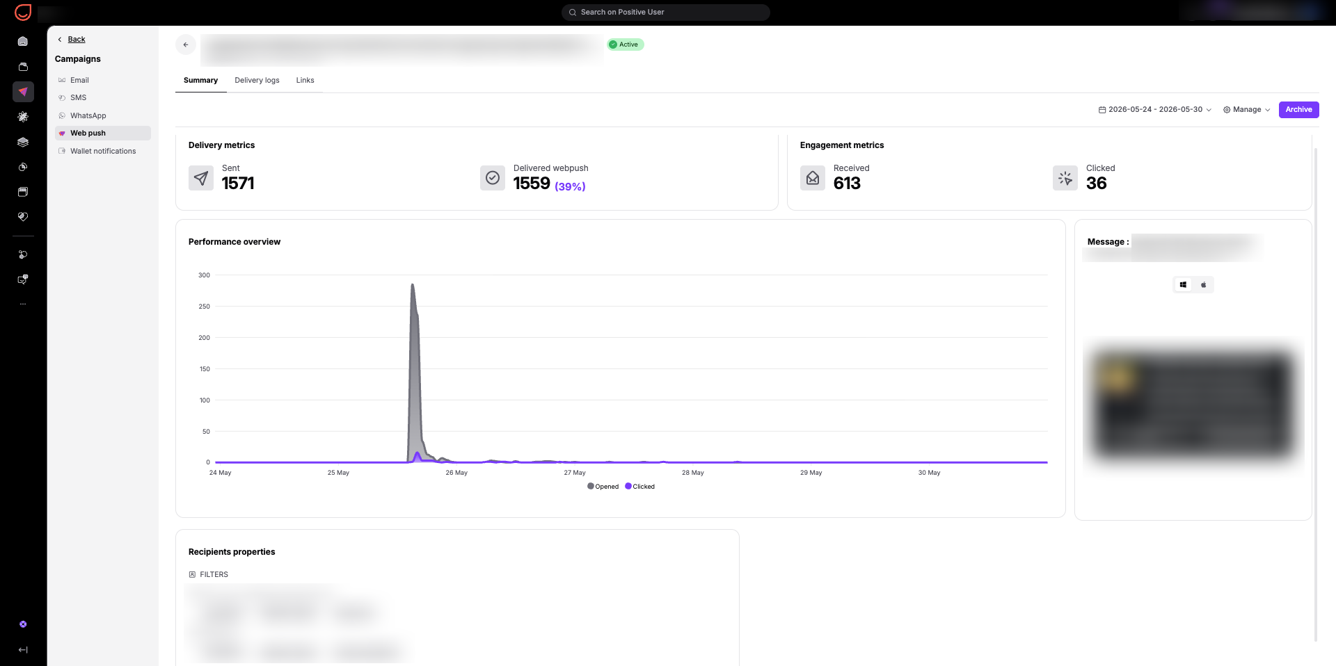
Opening any specific web push campaign profile takes you to a deep-dive performance view with three distinct tabs: "Summary", "Delivery logs", and "Links".
The "Summary" section gives you an immediate performance overview of a single campaign. It breaks down your critical delivery and engagement metrics into dedicated cards:
Delivery metrics: The total volume of notifications sent and the total number and percentage of notifications successfully delivered to a browser.
Engagement metrics: The number of notifications explicitly acknowledged by the contact's browser. Comparing this to delivered numbers reveals how many targeted contacts actually had their devices turned on and connected to the internet during the broadcast window. Additionally, the exact number of actions taken on the notification.
Performance overview: A timeline chart tracking "Opened" and "Clicked" actions over hours or days. This tells your business exactly how long your offer remains relevant after launch and when the peak engagement window occurs.
Message preview: A visual mockup showing how the welcome text, title, and buttons look on both desktop and mobile layouts.
Recipients properties: A summary of the filters applied for this specific campaign (if it’s a one-time delivery).
Your team can also apply time filters here to check how external events or specific hours influenced performance.
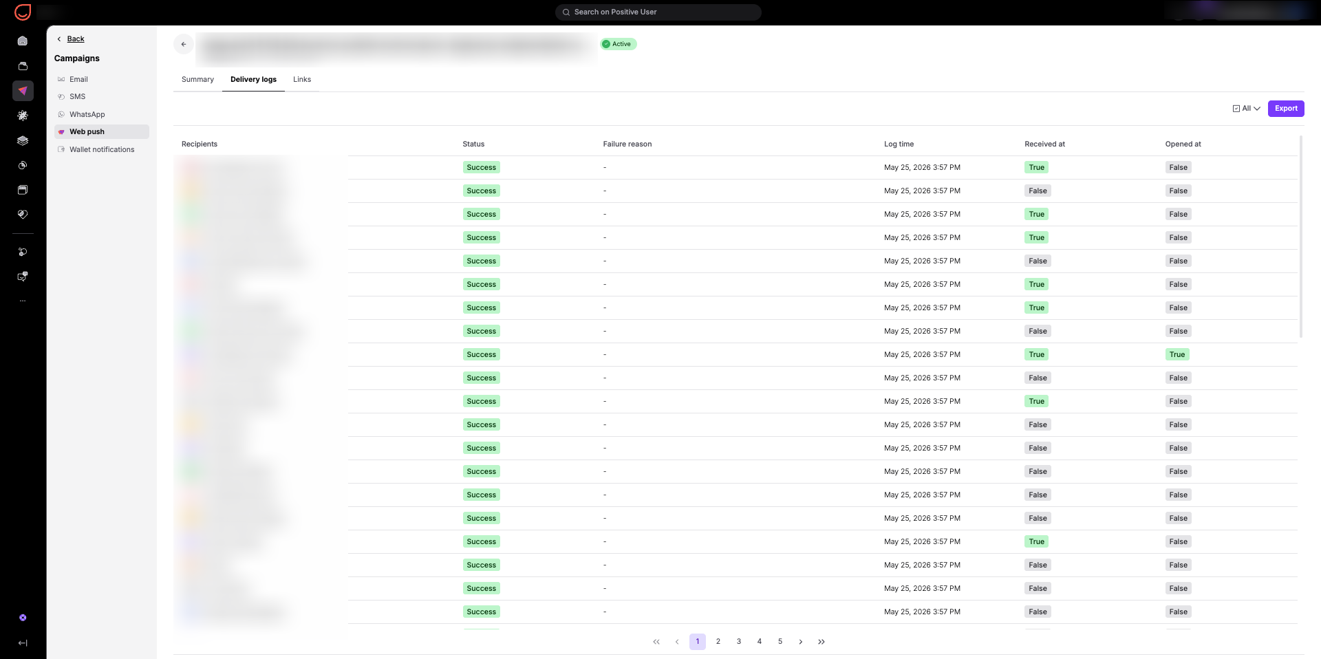
The "Delivery logs" tab shows a comprehensive row-by-row list of your recipients. This level of detail helps you audit individual delivery statuses:
Recipients: The name or profile identifier of the contact.
Status: Confirms a state of the delivery.
Failure reason: Provides exact technical feedback if a notification fails to deliver, helping your team clean your subscriber list of broken browser tokens.
Log time: The exact timestamp the notification was processed.
Received at and Opened at: Indicators showing exactly which individual contacts successfully received and interacted with the message and when they did it (hover to see the timestamp).
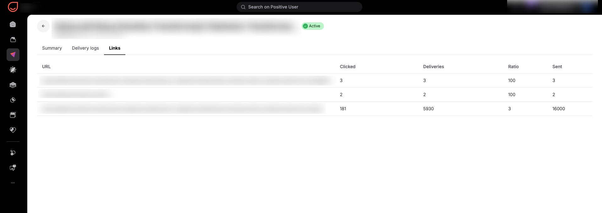
The "Links" tab isolates the statistics for the URLs included in your push campaign. It contains a clear table showing:
URL: The specific web addresses embedded in your push message.
Clicked: The total count of clicks generated by that specific link.
Deliveries: How many times the notification containing that specific URL was successfully delivered.
Ratio: The click-to-delivered ratio expressed as a percentage. This number tells your company exactly how appealing a specific call-to-action or product link is, letting you test different landing pages to find what drives the highest conversions.
Sent: The total volume of notifications dispatched with that link.
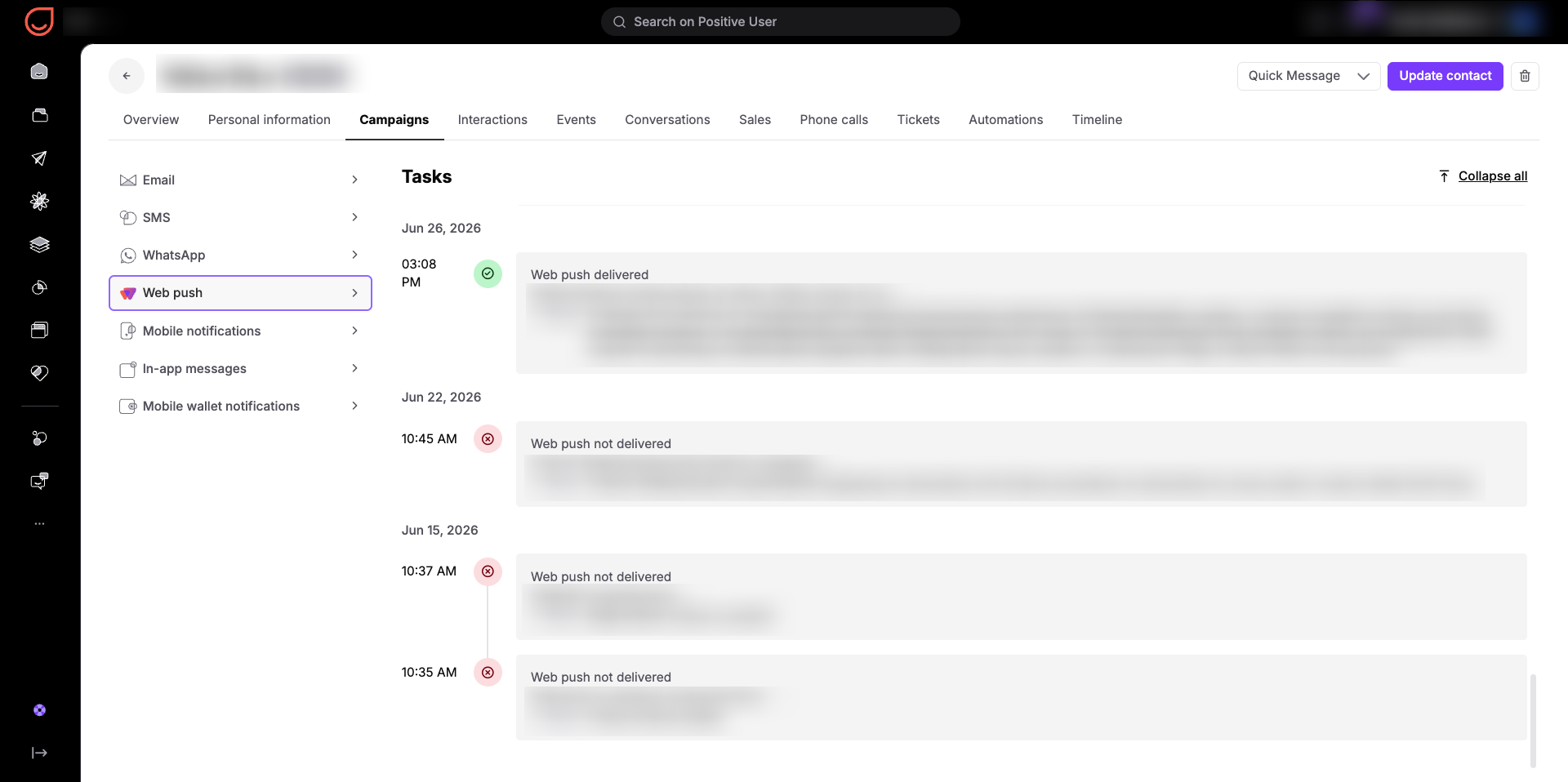
Your team can also analyze web push performance on an individual level. Go to the "Contacts” section, open a specific contact's profile, and navigate to "Campaigns" → "Web push".
This panel displays a full, chronological timeline of all web push campaigns directed to that specific person. The timeline logs every successful delivery as well as failed ones, along with the exact date, time, title, and body text of the message. This individual history gives your team full context on what specific notifications a contact has been exposed to, ensuring your customer support or sales teams can reference exact messaging during direct conversations.
E-Commerce Cart Recovery Evaluation: You can open an automated abandoned cart campaign and navigate to its "Links" tab to analyze the click-to-delivered ratio. By evaluating which specific product or discount link achieves the highest ratio, your team learns exactly what incentives motivate contacts to return and finish their purchase.
Re-Engagement Content Strategy Optimization: By reviewing the general "Statistics" tab, your marketing team can analyze your "Top 3 campaigns by deliveries" alongside workspace-wide engagement metrics over a chosen period of time. This analysis reveals whether your active subscribers respond better to short alerts or detailed updates, helping you choose the most effective approach for your next product launch.
Customer Support Personalization: Before reaching out to a customer, a team member can open the contact's profile and check their individual web push timeline. Reviewing which campaigns were successfully delivered and which were not provides immediate context on the exact offers the contact has seen, allowing for a more tailored and efficient support conversation.