The Simple Email Builder in Positive User is a drag-and-drop editor that lets you create responsive, professional email templates and messages without having technical skills.
You build emails by adding modules (blocks), then filling them with the content (content modules) customizing their layout and style (like colors, typography, spacing, borders, and more) directly in the editor.

When you create a new email message or template, you’ll work in a canvas-based editor:
Drag-and-drop blocks into your email to build the structure.
Then drag&drop content modules to fill the blocks with content.
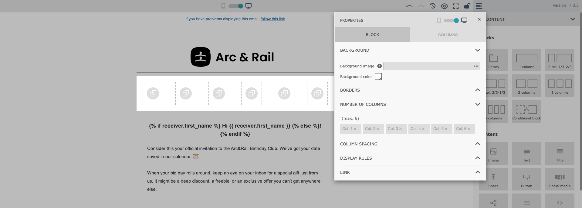
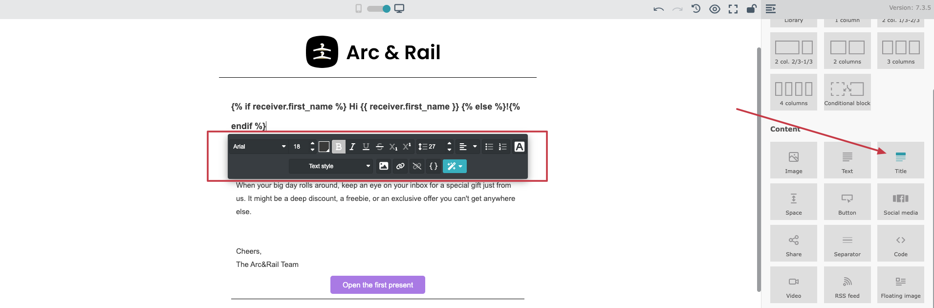
Click any module and choose the gear icon to edit it.
Configuration opens in a movable pop-up (you can reposition it anywhere on your screen).
Most visual options (styles, borders, typography, rounded corners) are available through settings, no custom code needed.
Finally configure general details (layout, themes, color dispatch, settings and preheader) in Style section on the right.
Check step-step instruction on creating email templates here.
Before adding content, you typically start by creating the layout of your template using blocks. These blocks define how your email is structured and how content will be arranged (side-by-side or full-width).
You can choose the number of columns in a row. The maximum number of columns is six.
This limit is intentional and is considered the optimal maximum to ensure proper rendering across almost all major email inbox providers. This approach results in cleaner, more readable layouts and minimizes the risk of display issues on different devices and email clients.
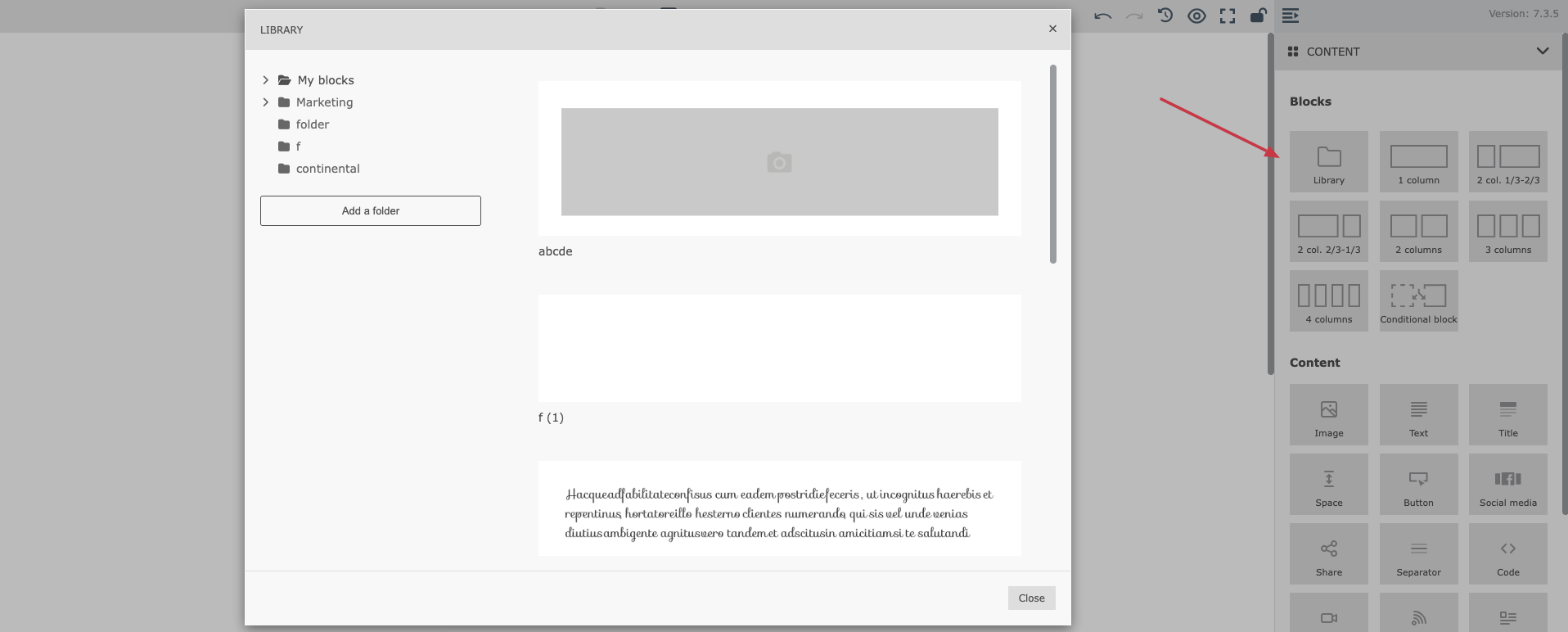
The “Library” feature helps you save time and maintain a consistent visual identity across all your email communications.
What it does:
Allows you to create, configure, and save reusable blocks (for example: headers, footers, banners, product sections, CTAs)
Saved blocks are stored in a shared library, accessible to your entire team
Any saved block can be reused in:
new email messages
new email templates
The “Library” is available directly inside the Native Email Builder, in the “Blocks” section on the right. By clicking on it you open the library of the saved blocks that can be easily injected into the email content you are working on.
Once you’ve created the structure of your email using blocks (for example, rows and columns), the next step is to fill the layout with actual content. This is where Content modules come in.
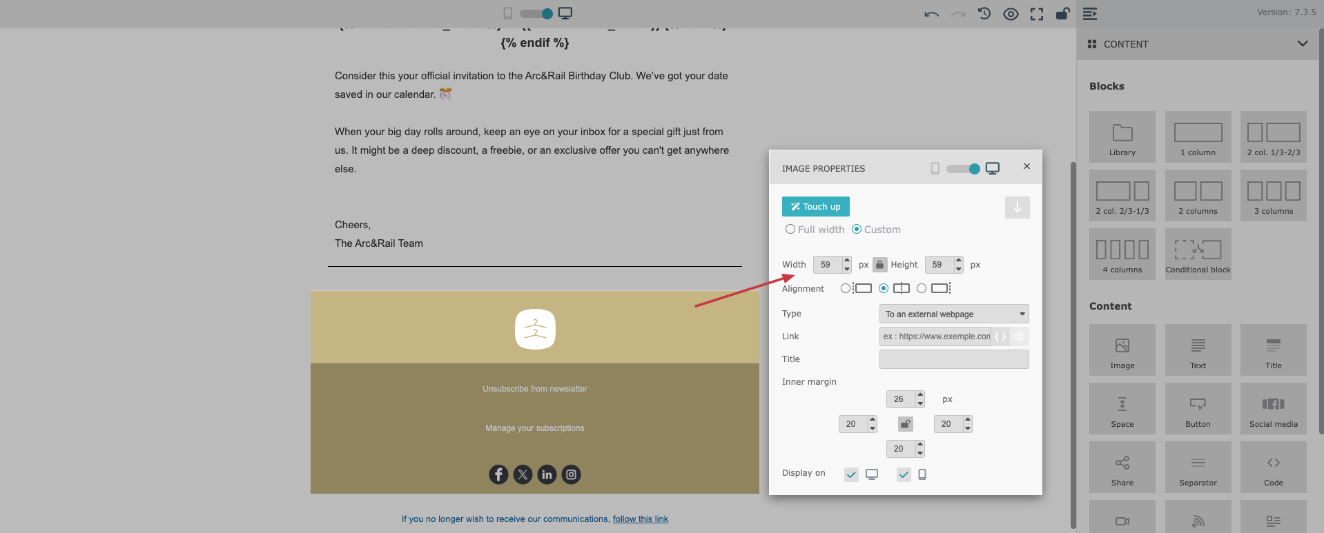
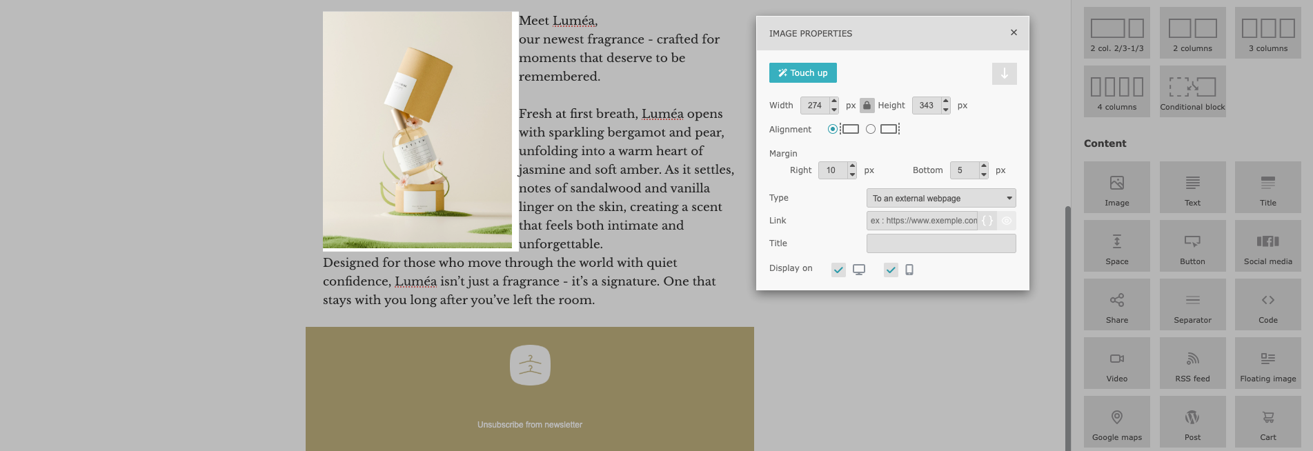
The “Image” module allows you to add visual content to your email template.
You can upload an image from:
your device
the image gallery
a specific URL
variables (dynamic content sources)
After inserting an image, you can configure:
image width
inner margins (padding)
the link the image should redirect to (you can use dynamic content in these links)
Pixel-based sizing offers more precise control over how images appear, helping you maintain consistent visual proportions across different email layouts.
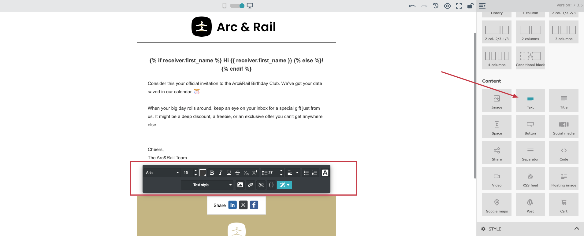
The “Text” module is one of the most commonly used content elements. It allows you to type or paste text directly into your email and format it as needed.
Text configuration includes:
font family
font size
font color
alignment
spacing and styling
You can also add clickable links inside your text, including links containing variables.
Additionally, the “Text” module allows you to insert a floating image, which helps create more flexible layouts with text flowing around visuals.
The “Title” module is used to add headings and section titles to your email. It helps structure your message and improves readability, especially in longer emails.
With the “Title” module, you can configure:
font type
font size
text styling
alignment and spacing
This module is useful when you want your headings to have a different style than the main body text.
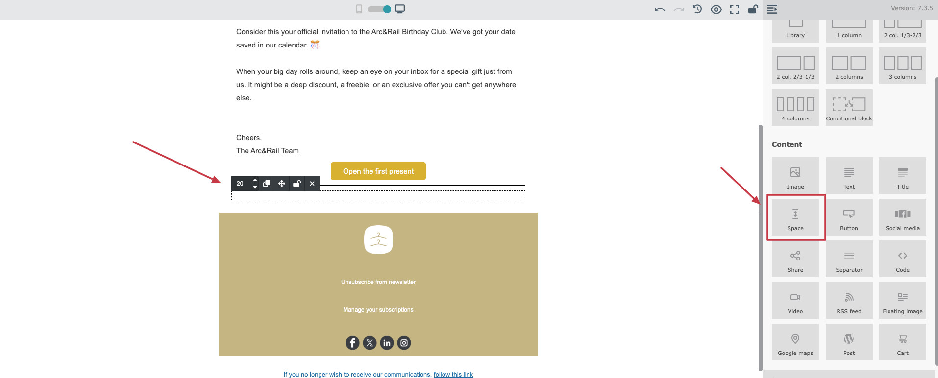
The “Space” module is a dedicated element used to create blank space between different blocks of content. It can be placed anywhere in your email content, giving you clearer control over layout structure and vertical rhythm.
You can configure:
the height of the space (to create more or less blank area)
This module is especially useful for improving readability and keeping a clean layout across both desktop and mobile views.
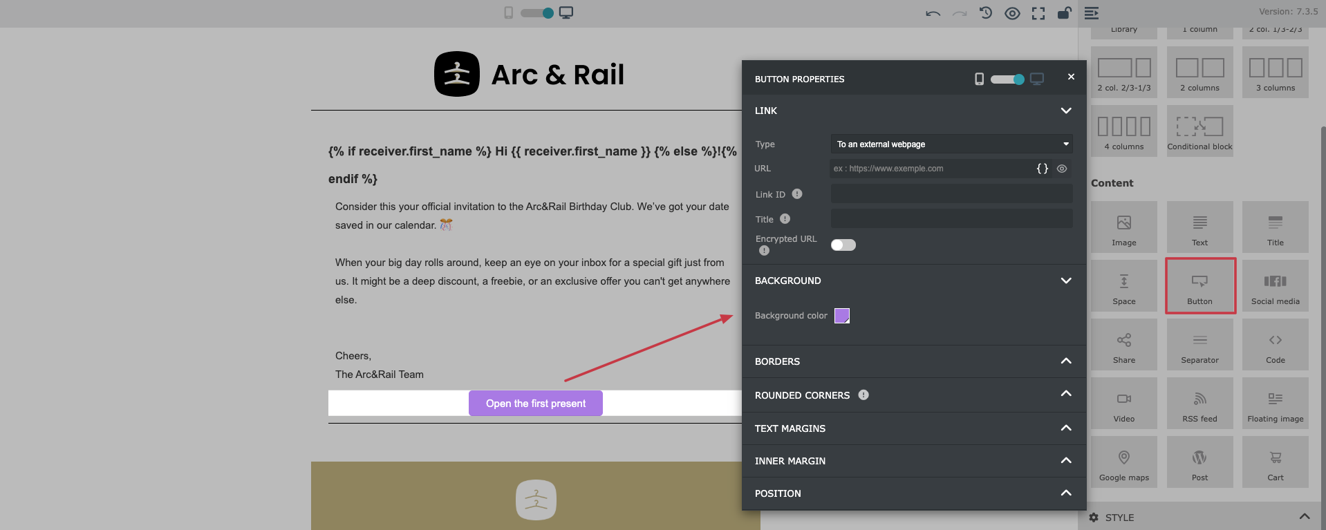
The Button module allows you to add a clear call-to-action (CTA) to your email.
In the button settings, you can configure:
the button URL (including dynamic content)
button text
colors (background and text)
rounded corners
alignment and placement
spacing and padding
Buttons are essential for guiding recipients toward the next action, such as visiting a page, confirming a decision, or completing the process.
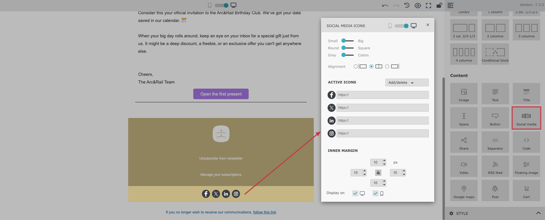
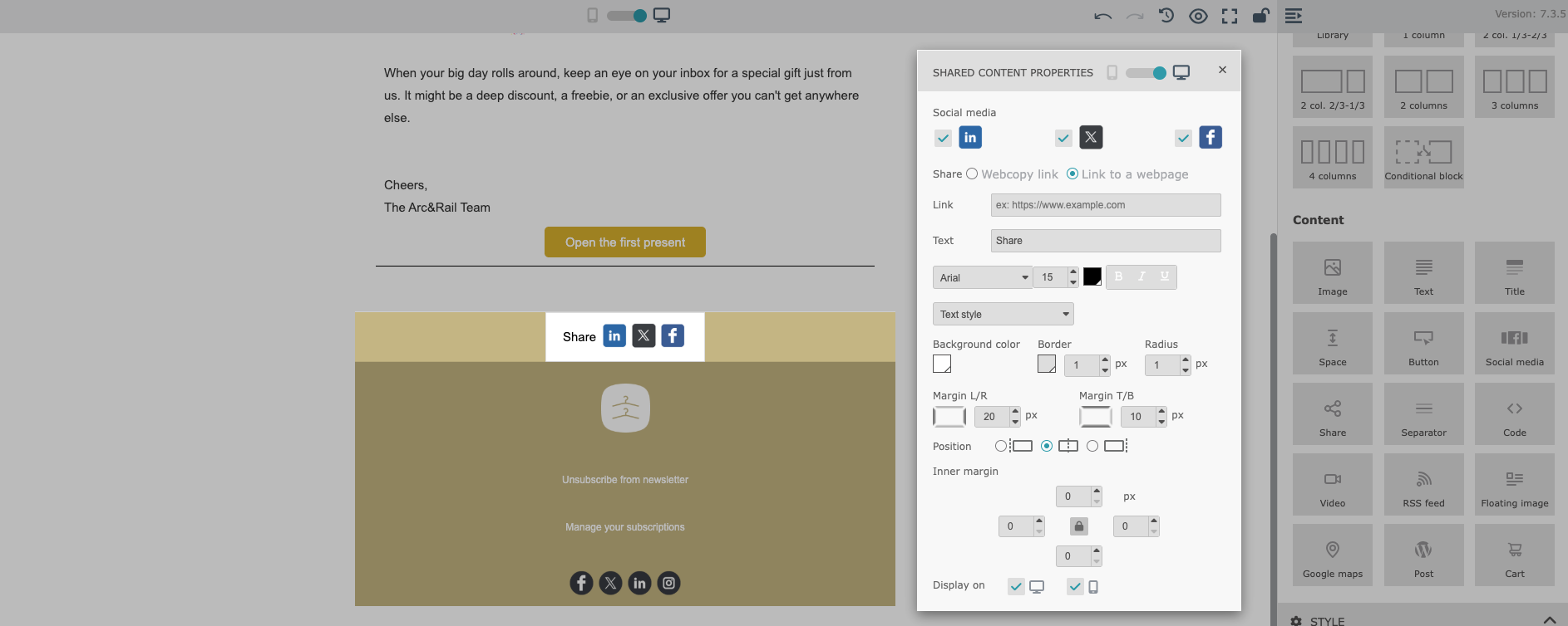
The “Social Media” module allows you to add clickable icons that link to your social media profiles. It supports all the most popular platforms, making it easy for recipients to connect with your brand outside of email.
In the module settings, you can configure:
the social media platforms to display
the profile links for each platform
icon size
icon style (rounded or square)
color scheme (colored icons or grayscale)
alignment (left, center, right)
inner margins and spacing
This module is often placed in the email footer, but it can also be used in promotional sections where you want to encourage engagement.
The “Share” module enables recipients to easily share your content on social media directly from an email. It allows recipients to click a social media icon and generate a draft post on the selected platform.
You can configure sharing for multiple platforms, including:
X (formerly Twitter)
The shared link can be:
a direct web page URL
or a web copy link related to the email content
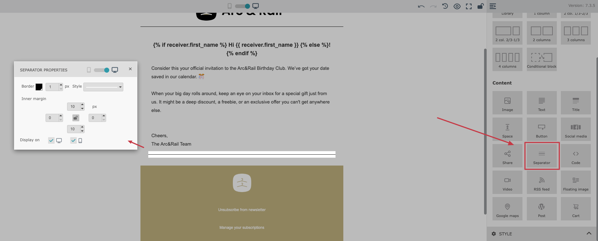
The “Separator” module is used to create a visual division between different sections of your email. It improves readability and helps organize longer email messages.
The Separator width is automatically set to 100%, which ensures more consistent rendering across different email clients, many of which handle custom-width dividers inconsistently.
In the settings, you can configure:
line style
border thickness
spacing and inner margins
Separators are useful for breaking up content, separating header/footer areas, or visually dividing product sections.
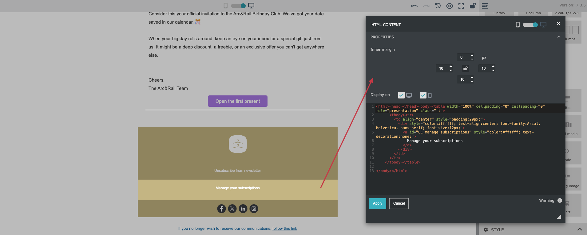
The “Code” module allows you to inject your own custom HTML directly into the email message.
This is useful when you need advanced customization that isn’t available through standard drag&drop modules. It also enables additional personalization and design flexibility for more technical users.
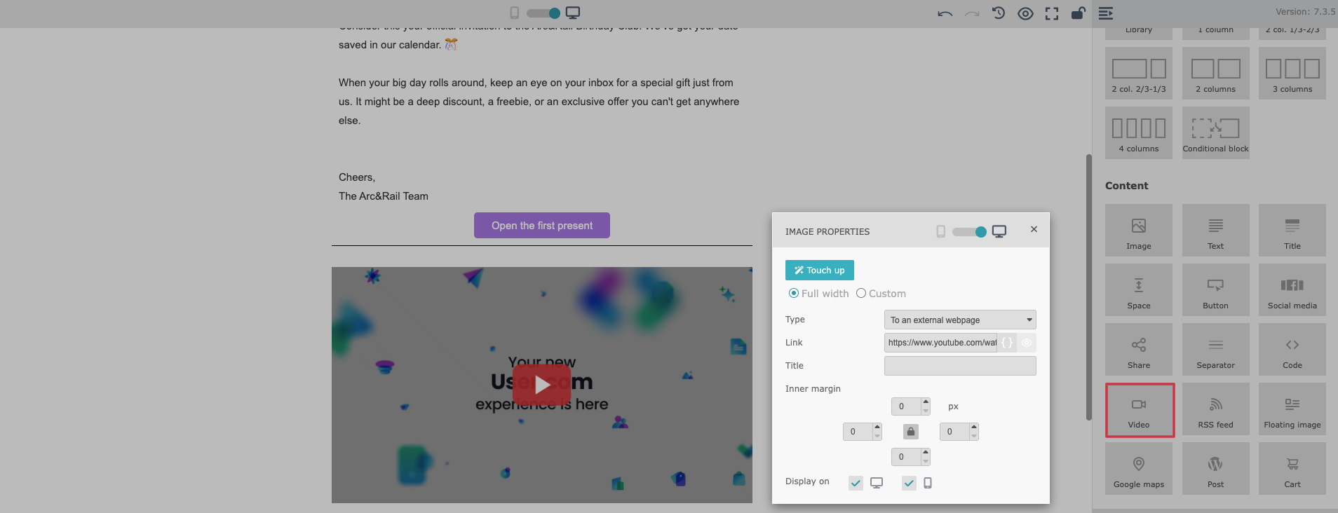
The “Video” module allows you to insert a video preview into your email message. Since most email clients do not support embedded video playback directly, this module generates a clickable preview image.
When a recipient clicks the video preview, they are redirected to the external page where the video can be played.
The video preview (JPEG format) is supported for:
YouTube
Dailymotion
Vimeo
This module is ideal for promotional campaigns, product demos, webinars, and announcements where video content is the main highlight.
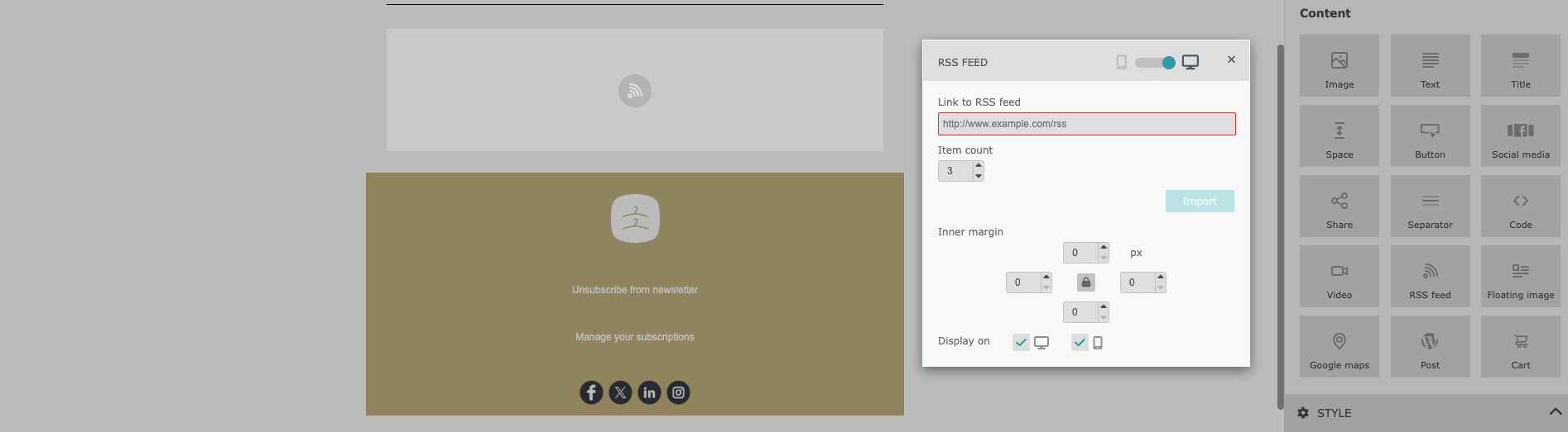
The “RSS Feed” module allows you to automatically include content feeds directly in your email messages.
The RSS Feed module is ideal for keeping your emails fresh, relevant, and up to date without manually updating content every time. Once configured, the email content updates automatically based on the feed:
Lets you paste an RSS feed URL
Automatically pulls content from the feed into your email
Displays up to 10 items, each containing:
article title
link
short description
You can fully control the number of items shown in the email, depending on how content-heavy you want the message to be.
The “Floating Image” module combines an image with surrounding text, giving you finer control over layout balance and visual storytelling.
Displays an image with text flowing next to it
Lets you decide whether the text appears on the left or right side of the image
Supports images:
uploaded directly from your device
selected from the media gallery
added via an external URL
Includes a built-in touch-up feature that allows you to adjust the image directly within the Email Builder
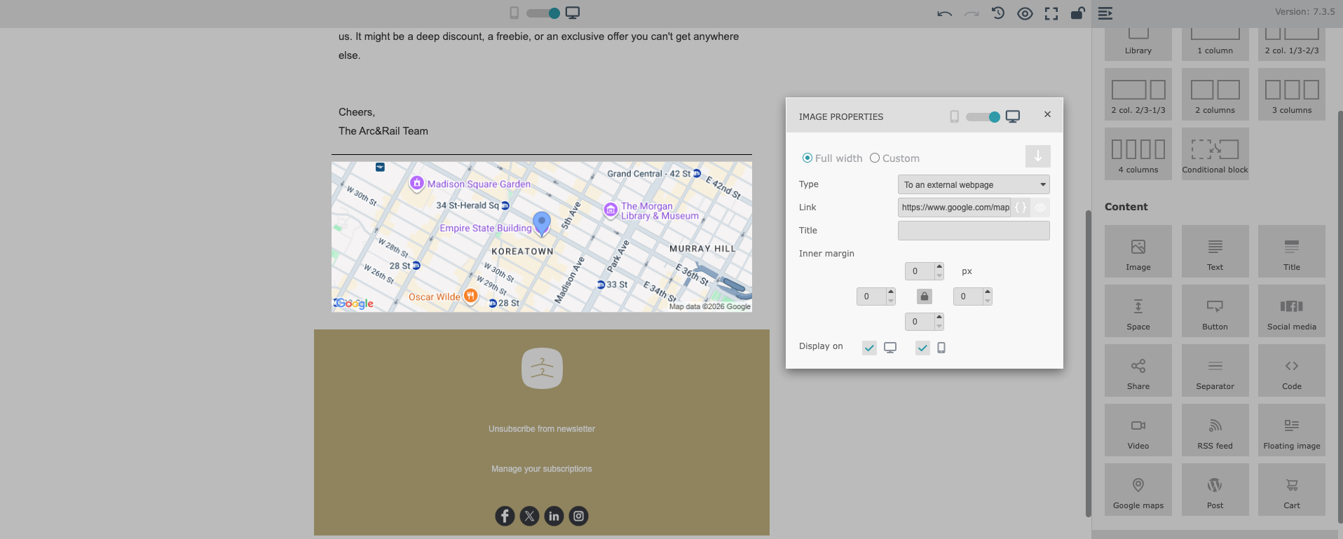
The “Google Maps” module makes it easy to showcase physical locations in your emails. Simply enter an address, and the module generates:
A map preview of the location
A clickable link that opens the address directly in Google Maps
This is ideal for highlighting the location of your business, shop, office, or any other place you want to present clearly to your recipients.
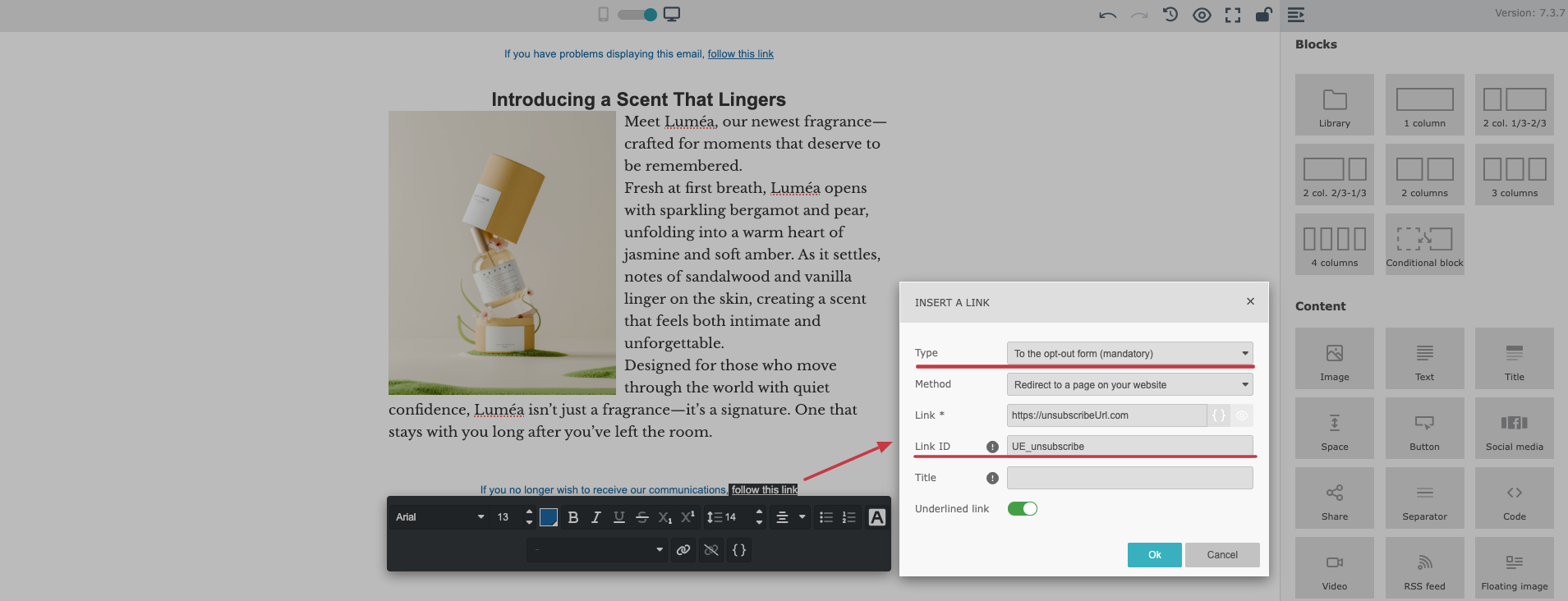
In the Simple Drag&Drop Builder, the unsubscribe option is automatically included in every email template to ensure compliance with email regulations.
By default, the unsubscribe link is placed in the footer of the message/template.
You can click the unsubscribe text in the footer and edit it using the standard text editor. This allows you to modify:
the text itself
font type and size
color
styling (bold, italic, etc.)
If you click the “Link” icon and choose the “Opt-out form” link type, you can change the “Link ID” from global unsubscribe to an “unsubscribe from a specific list link’.
If you want to remove the unsubscribe link from the footer and place it somewhere else in your email:
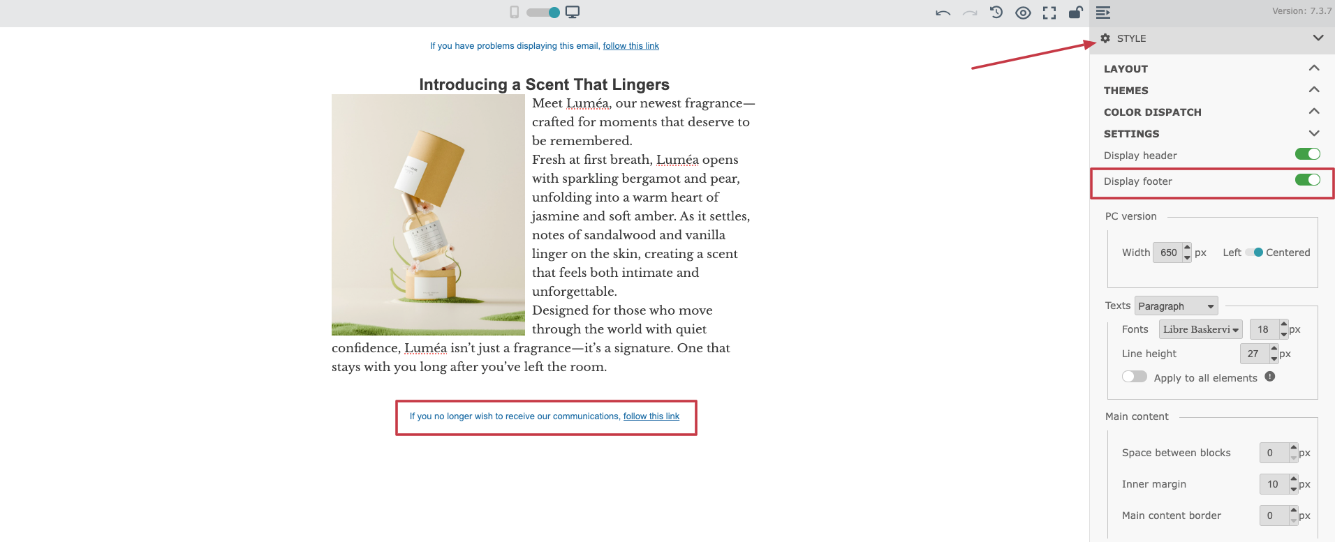
Go to the “Style” section on the right panel.
Find the “Display footer” toggle.
Turn it off to remove the unsubscribe link from the footer.
After disabling the footer, you can manually place the unsubscribe link in another part of your email layout by adding a classical link with “Opt-out form” link type and suitable the “Link ID”.
The “Style” section in the right-side panel of the Simple Drag&Drop Builder allows you to configure the global design settings of your email template. This is where you define the overall layout, branding colors, fonts, spacing, and the preheader text displayed in inbox previews.
In the “Layout” section, you can configure the general structure of your email template, including overall layout preferences and design consistency.
This section also allows you to create an automatic alternance of colors, which helps build visually clean and readable templates without manually styling every block.
The “Themes” section lets you choose predefined color themes for your email design. Once selected, the theme colors can be applied automatically to your email template.
You can also enable a toggle to “apply the theme to all elements”, which is useful when you want to quickly unify your design and maintain brand consistency.
The “Color Dispatch” section gives you full control over colors assigned to specific types of elements in your template. Here you can define color settings for key parts of your email such as:
header and footer
body background
block background
block borders
button background
button borders
button text
titles and subtitles
You can also apply these settings globally. Use the “apply to all elements” option carefully. Turning it on may reset all customized colors in your email template and replace them with the new global configuration.
The “Settings” section allows you to manage general template behavior and global appearance.
Here you can configure:
whether the header should be displayed
whether the footer should be displayed
the email width and layout centralization
default font family, font style, and font size
general spacing between blocks
The “Preheader” section is one of the most important settings for email performance.
The pre-header is the short preview text that appears next to (or below) the subject line in your recipients’ inboxes. It strongly influences whether people open the email, so it should be carefully written and relevant.
A well-written pre-header can significantly improve open rates by clearly explaining the value of the message before it is opened.
You can switch between desktop and mobile views to make sure your email looks good on all devices. You can also set specific elements to appear only on desktop or only on mobile to follow your custom design decisions.
To review your design, use “Preview” with a contact email address to render real data. It’s especially important if you use dynamic content in your email template. You’ll see a realistic preview of the final email with dynamic content filled in. We strongly recommend doing this before using the template in a live campaign.
You can also send a test email. Just use a “Send a test” button on top of the panel. It’s an important step to ensure correct rendering in email inboxes.
Once you are ready with the content and configuration of the email template, remember to save the progress using the “Save” button in top right corner of the editor. Remember, that no changes are saved automatically!
When you want to exit the builder, choose “Save and exit” option. You can always find your template in “Studio” → “Templates” section and apply new changes.
